
Configure Your Widget
Customize your widget's appearance, behavior, and messaging to match your brand and user needs.
Access Widget Settings
Navigate to Build > Integrate > Channels and select your widget to access configuration tabs.
You can configure the widget using the following tabs:
-
Format & Design: Customize the appearance.
-
Greetings: Define how your bot welcomes users.
-
Handover (Bot Managers only): Manage transitions between bot and human agents.
-
NPS: Activate Net Promoter Score surveys.
-
Integration: Set up widget integration and sharing.
-
Advanced: Configure advanced settings.
A menu in the top-right corner allows you to duplicate or delete the widget configuration. You can also associate the duplicated widget with a new language.
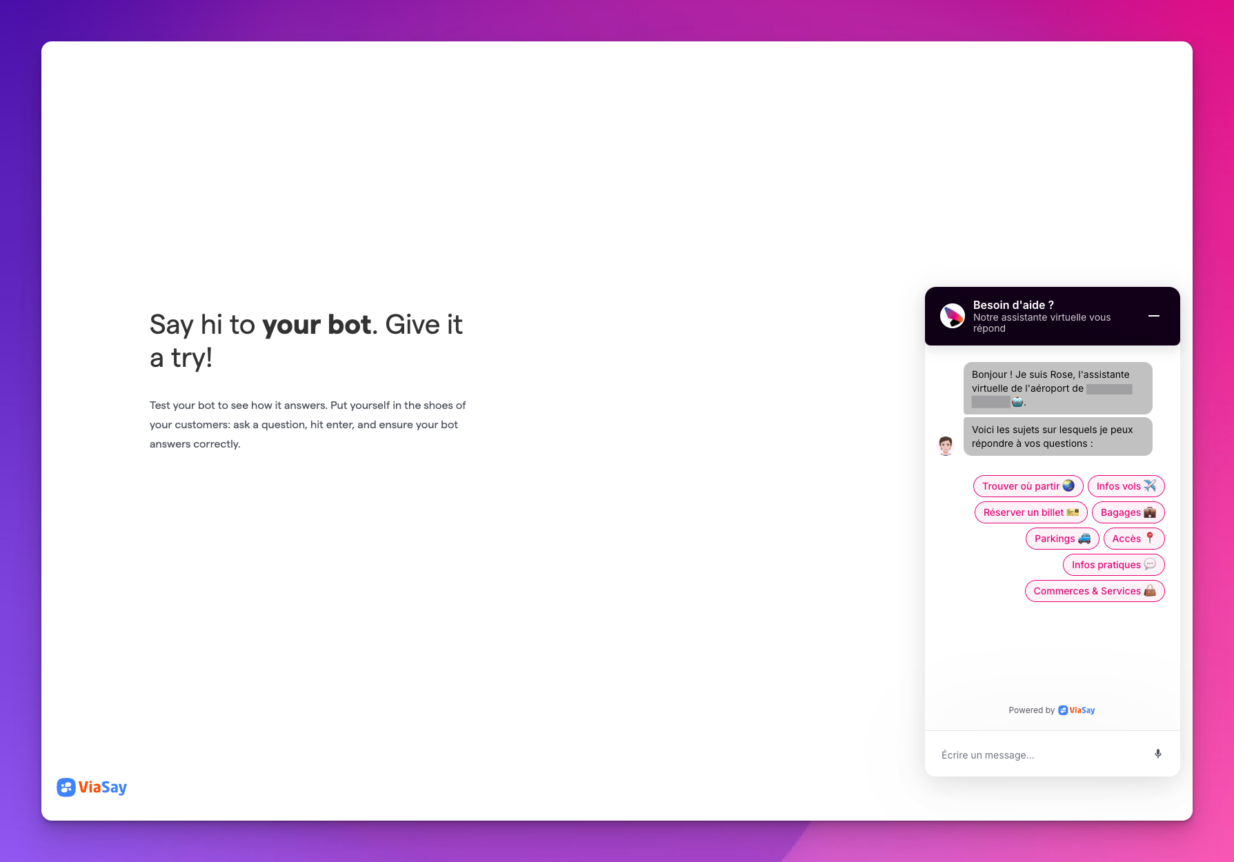
ViaSay Chatbot Widget Overview
The ViaSay Chatbot Widget is a straightforward chat interface that can be easily integrated into your website.
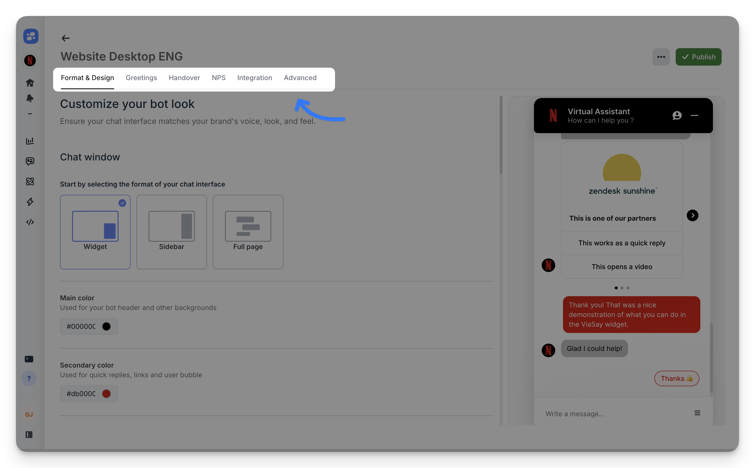
Format & Design
Define your widget's visual identity and position on your website.
Chat Window Format
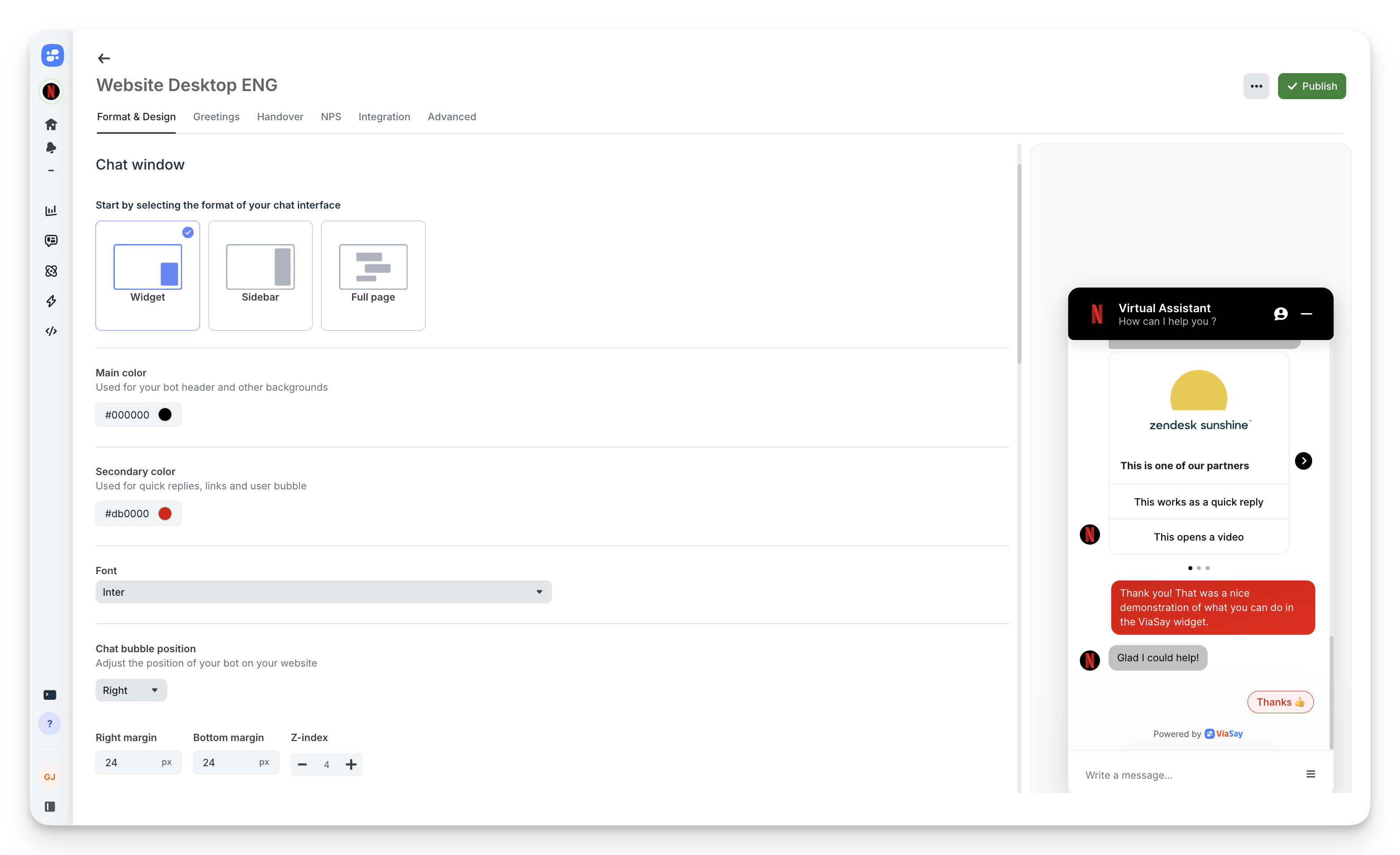
Choose between three display modes:
- Widget: Classic chat bubble in corner (recommended)
- Sidebar: Fixed panel on page edge
- Full page: Dedicated chat page
Colors and Typography
Main color: Header and background color (hex code)
Secondary color: Quick replies, links, and user message bubbles
Font: Select from available typefaces
Chat Bubble Position
Position: Choose left or right corner
Margins: Adjust spacing from edges (right margin, bottom margin)
Z-index: Control layering with other page elements
Persistent Menu
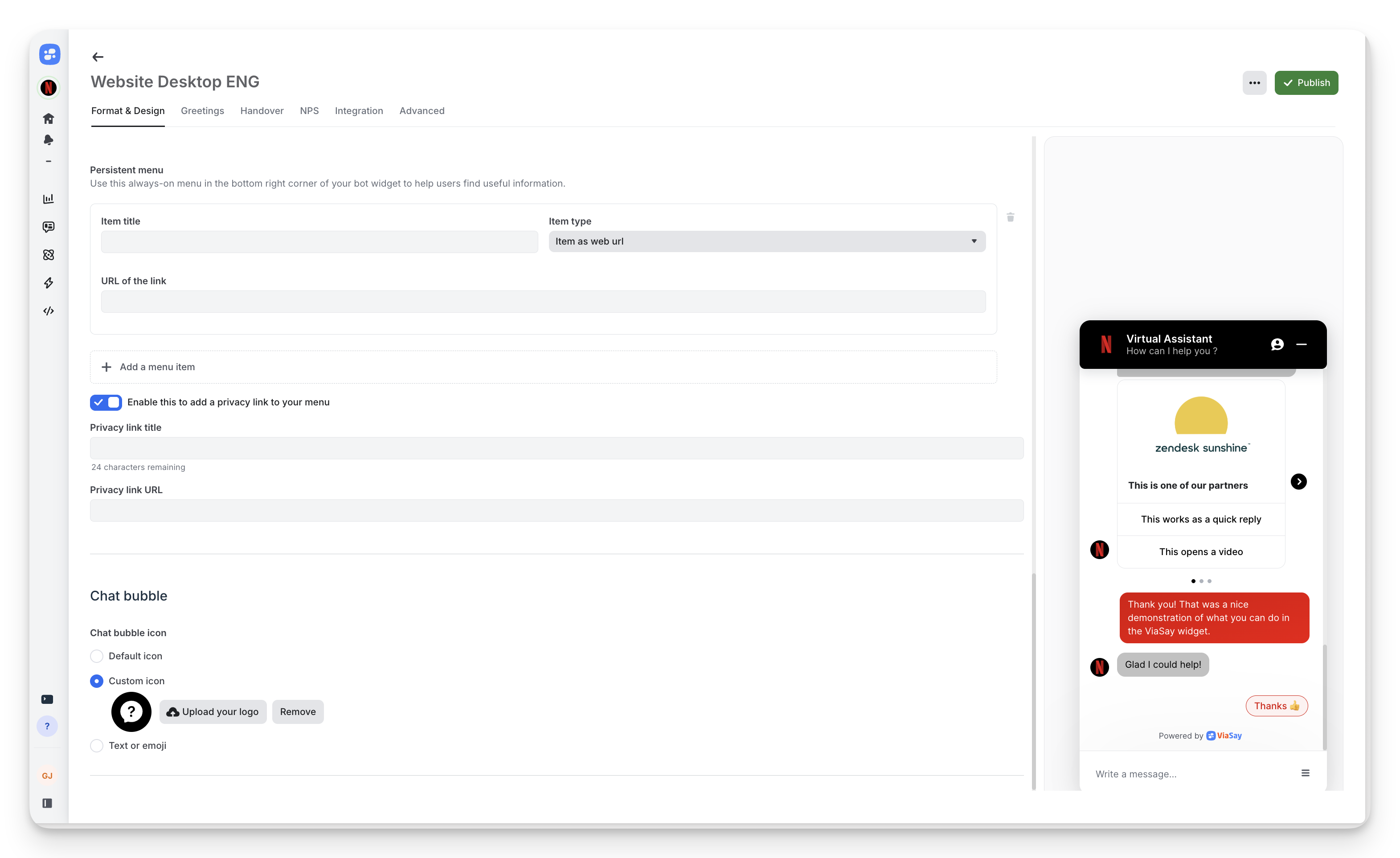
Add always-visible menu items in the widget footer:
- Item title: Display name (e.g., "FAQ", "Contact")
- Item type: Link to web URL or trigger bot action
- URL: Destination for web links
Privacy link: Enable to add GDPR-compliant privacy policy link to menu.
Chat Bubble Icon
Default icon: Use ViaSay's standard chat icon
Custom icon: Upload your logo (square format, 60×60px recommended)
Text or emoji: Display custom text or emoji instead of icon
Auto-opening: Control when chat opens automatically (on click only, after delay, etc.)
Greetings
Set the first message users see when opening the widget.
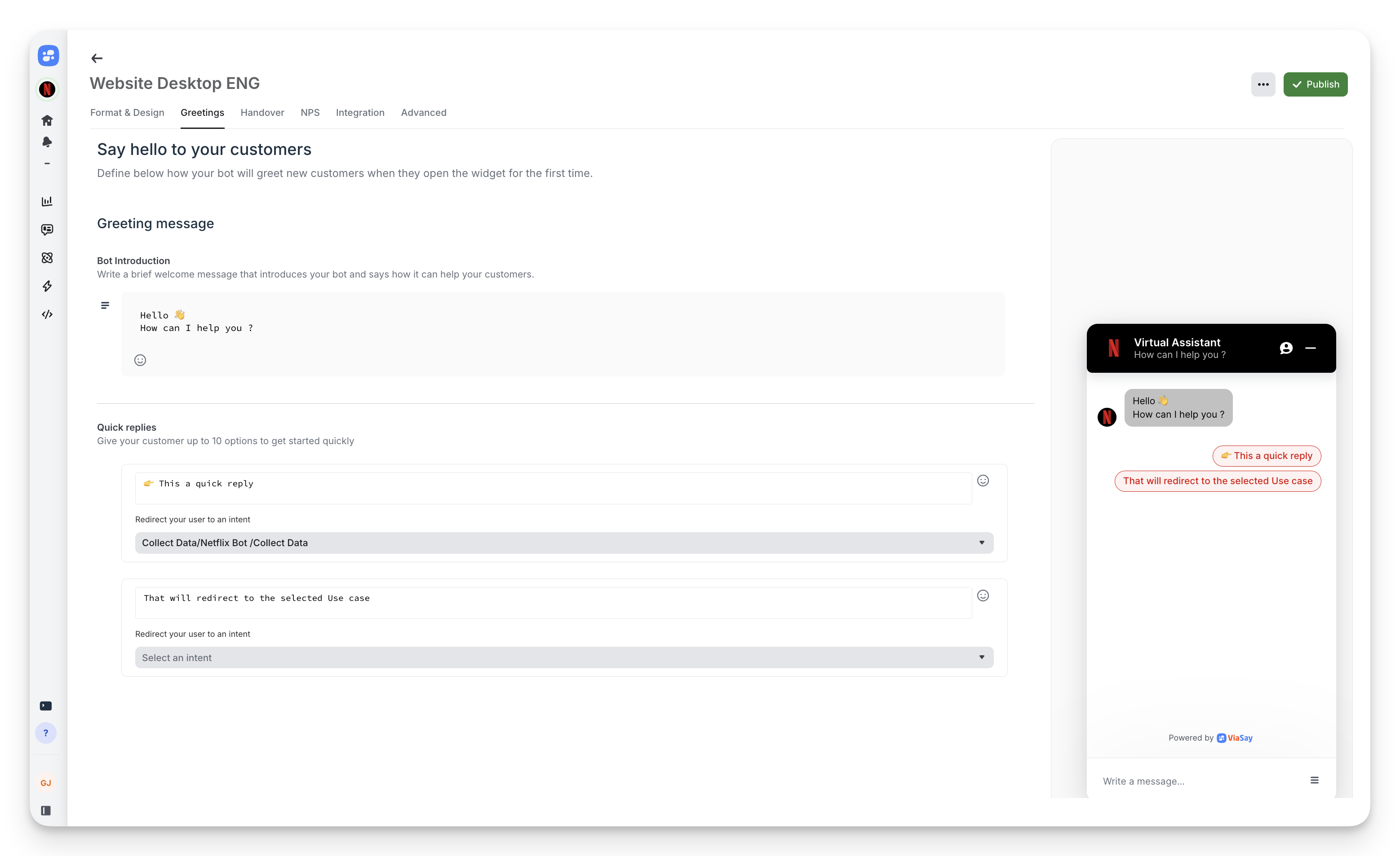
Bot Introduction
Message text: Write a concise welcome (e.g., "Hello 👋 How can I help you?")
Quick Replies
Add up to 10 quick reply buttons to guide users toward common topics:
- Click + Add a quick reply
- Enter button text (e.g., "Track my order", "Pricing", "Technical support")
- Quick replies launch corresponding bot flows
Handover
Configure human agent escalation from bot to live support.
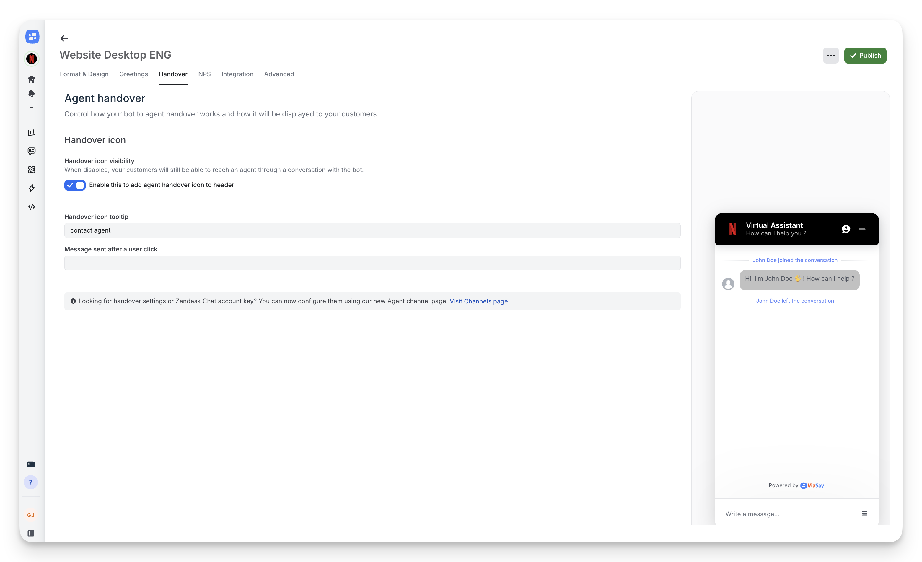
Handover Icon
Visibility: Toggle to show/hide agent contact icon in widget header
Tooltip text: Customize hover text (default: "contact agent")
Trigger message: Message sent when user clicks handover icon
⚠️ Requires agent channel configuration.
NPS
Collect customer satisfaction data with Net Promoter Score surveys.
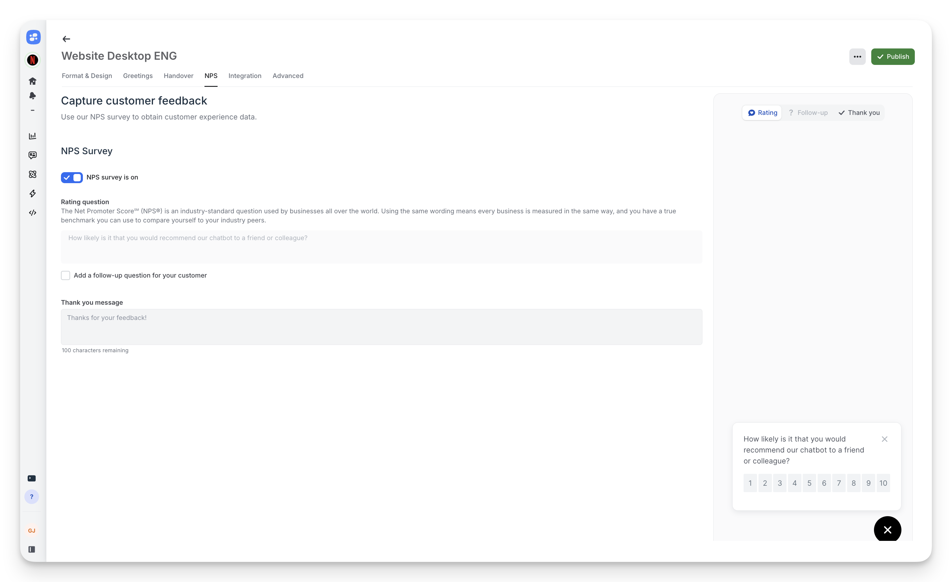
Enable NPS Survey
Toggle NPS survey is on to activate.
Rating Question
Default uses industry-standard NPS question: "How likely is it that you would recommend our chatbot to a friend or colleague?"
Follow-up question: Optionally add a text question after rating (checkbox to enable)
Thank You Message
Customize the message shown after survey completion (default: "Thanks for your feedback!")
Integration
Access your installation code and test the widget.
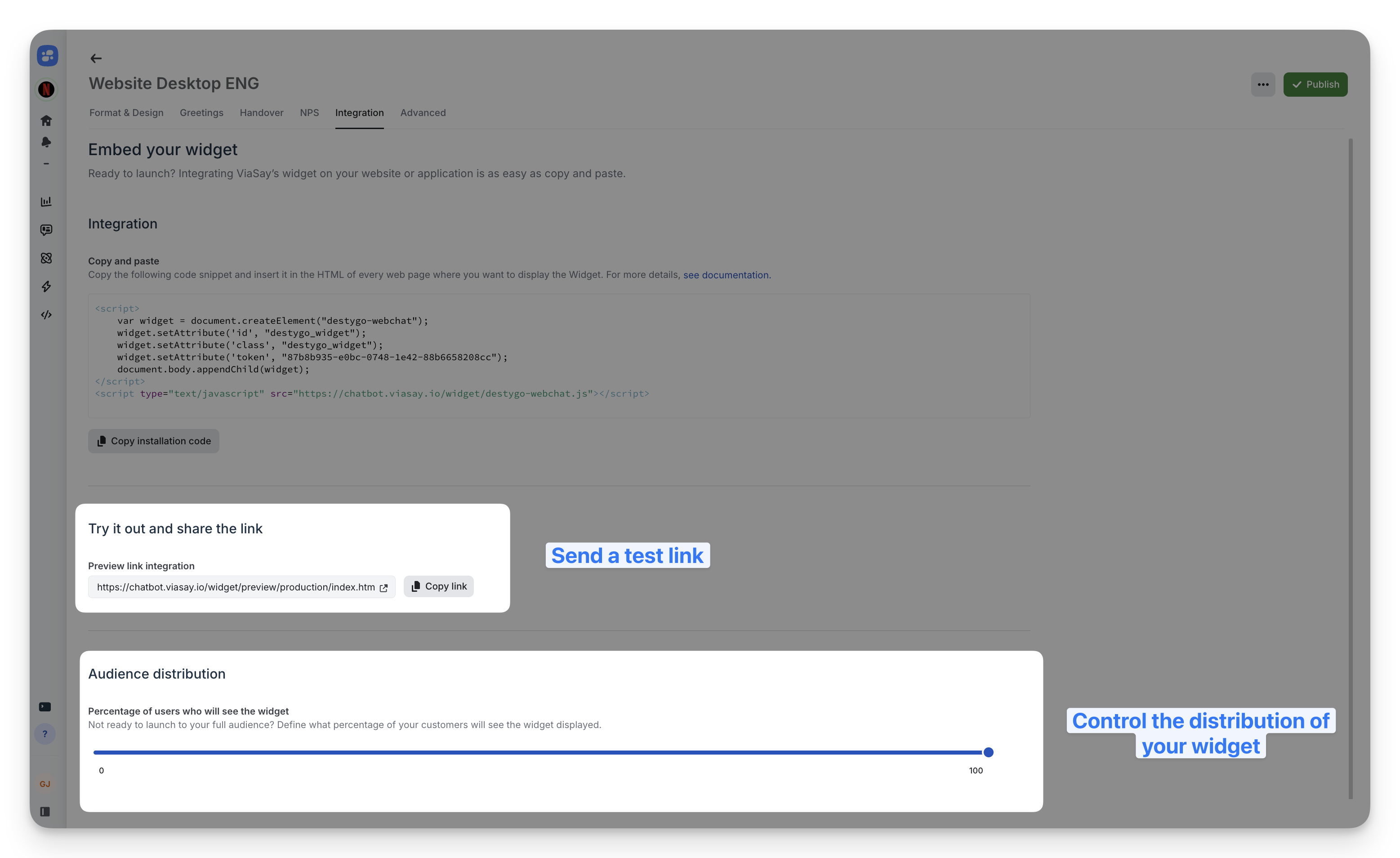
Installation Code
Copy the JavaScript snippet to embed on your website. Each widget has a unique token.
Follow this documentation to install your widget
Preview Link
Test your widget configuration before deployment using the preview URL.
Audience Distribution
Control what percentage of visitors see the widget (0-100%). Use for gradual rollouts or A/B testing.
Deploy Invisible, Launch When Ready
Set Audience Distribution to 0% during setup. The widget code deploys to production but remains hidden. When ready to launch, adjust the percentage in Integration to control visibility—no code changes required.
Advanced
Fine-tune technical behaviors and metadata.
Connection Timeout
Enable connection timeout: Automatically close backend connection after user inactivity to optimize resource usage.
Customer Reference
Assign a custom identifier to the customer_ref property for segmentation and conditional logic in bot flows.
Link Behavior
Open links in new tabs: Enable to open URLs from bot messages in separate browser tabs.
ViaSay Branding
Display text crediting ViaSay: Toggle "Powered by ViaSay" footer text (enabled by default).
Bot Starting Action
Select which user action triggers the bot's initial message (default: Start User Action).
Best Practices
Test in preview: Always validate changes in preview mode before publishing.
Mobile-first design: Check appearance on small screens; adjust margins if needed.
Clear greetings: Keep welcome messages under 100 characters; use quick replies for guidance.
Brand consistency: Match main color to your website's primary brand color.
Strategic NPS timing: Survey after successful bot interactions, not immediately on open.
Publish Changes
Click Publish in the top-right corner to push configuration changes live. Changes apply immediately to deployed widgets.